
Airline Maps – Now You See, Often You Don’t
Thursday, 28 March 2013Forget the movie, I want the moving map up in front of me when I’m flying places. Often it alerts me to look out the window at whatever is passing by underneath. And even if there’s nothing to see I still want to know where we’ve got to, how much further we have to go or how high and how fast we’re flying. Three problems with these maps, here’s one from a recent Singapore Airline flight. ▼

1. Usually they’re remarkably uninformative, just the basic information, big towns and nothing more. Why can’t we find out about what’s down below, or be alerted to interesting things that aren’t simply some bland town or city name?
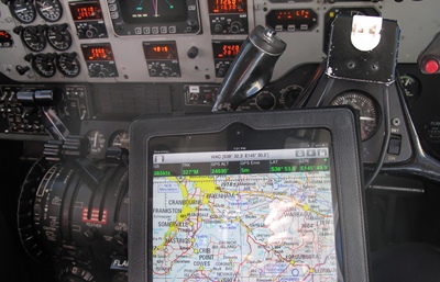
▲ There’s no reason we can’t be shown a lot more, here’s an iPad moving map on my knee during a recent light plane flight from Launceston in Tasmania to Melbourne.
2. Often you can’t see the screen at the most interesting parts of the flight – the screen is folded away for take-offs and landings for example. Remarkably this is more likely to be the case up at the sharp end of the plane than back in economy, where if you’ve got a screen it’s probably on the seat back in front of you. Recently I made a flight in First Class in a Boeing 777-300 with British Airways – not only did the screen have to be folded away at those times, but the seat was also aligned so you couldn’t see out the window and even if the seat had been ‘properly’ aligned the window was so badly designed you could hardly see out of it anyway.
3. And then if the screen is in a position for you to see it’s quite possible – step forward Singapore Airlines – they’ll turn it off during those most interesting periods.
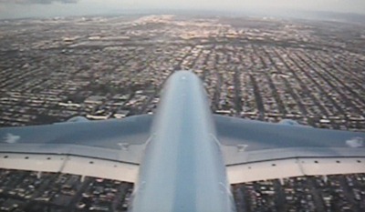
▲ An honourable exception? The Qantas A380s that also have a terrific tail-mounted camera. Here we are on the final approach into Los Angeles International Airport (LAX).